Posts By :

eriks

eriks

Erik was an Innovation Coach at the AT&T Foundry. He was also the CTO of Spot.us, a global platform for community-funded local reporting (winner of the Knight News Challenge). Previously, Erik co-founded Allvoices.com, where he served as the VP of Social Media and User Interface. Allvoices.com is a global community that shares news, videos, images and opinions. At the Reuters Digital Vision Program at Stanford University between 2005-2006, he created the website inthefieldONLINE.net, which drew widespread recognition from major global media including PBS, CNN and BBC, and was featured on Discovery International’s Rewind 2006 as one of the 25 highlights of the Year.

What is innovation?

150 150 eriks

Innovation to me is about creating simple, approachable and accessible experiences solving an actualneed of those users. Today innovation is too often however consider as (solely) advances in technology. I think that consistutes a lot of the challenges we now see in the technology industry as it celebrates and glorifies the tool rather than what the tool creates. Think of it this way: We celebrate the beauty of houses built, not the hammers used to build them. Yet we often do the completely opposite for technology, especially for information technology.   

I have worked in the high-tech area for my entire career and I am often surprised by the what I consider exaggerated focus on advances in technology.  It is very awkward and hard to work this way which one key reason why I have personally never understood this approach. The use cases or needs are then sought after and identified after the fact. If an actual need cannot really be identified, a need is artificially created which then consequently requires a continuously and constantly support to maintain the perception of a need. 

I usually bring up a conversation I had early on with my first mentor in web development. I had built a photo gallery which I personally (at the time) thought was great. I proudly showed it to a bunch of my friends explaining all the features I had carefully thought through on my own with out any input from someone else. To my big surprise, they did not understand how to use it or acknowledge what I believed was a very cool gallery. I grew more and more frustrated with explaining how to use the gallery to them. 

A bit disappointed and shocked at their reaction, I went to my mentor seeking validation that my frustration was justified and that my friends simply did not get it how cool my solution was. His comment back has been instrumental in shaping why I so strongly believe that addressing the user needs first and foremost without considering anything else is essential to any success. 

Me: I cannot understand why they do not like or understand this. Look at all this… (went on to show him all the amazing features I have built)

My mentor (interrupting me as I passionately demonstrate it once more): Did you build this photo gallery considering what a person would do in real life with photos? 

Me: No, I think this is a better organized way. Look how you can do this… (started to demonstrate the gallery again)

My mentor (interrupted me again): Did you build this in a better way according to you or according to them? If not for them, would it not be easier to just build it as they currently behave or to design an experience that matches their behavior?

Me (to some extent stunned): Yes, of course. You are right.

Since that day I live by that if a user do not get how to use your solution, you are always to blame. The users are neverto blame. It is a process to fight the urge and I by no means claim I am perfect here. The users must befront and centered in anything we do. Any solution or experience must be designed and implemented so that it seamlessly fits into the social fabric and context of the users. 

Again, there is nothing per se wrong with saying that innovation is advances in technology yet it very easily implies that technology is more important or valued than the experience or even more concerning less important or valued than addressing the actual needs of the end users. To me that is the absolute key – addressing the needs of the end users.

We too often measure the appeal, success, and progressiveness of companies today predominantly on their perceived and/or actual advances in technology. However, we should rather measure them on the extent in which they more easily and simplistically address the end user needs considering onlythe users. I fully understand and appreciate the intrinsic tension with the business perspective yet it is important to never lose track of the ultimate driver for any business – its users and how you address their needs.

Ultimately, to me, this has eroded the word (and concept of) innovation making it meaningless or the very least highly misleading. I personally believe we have forgotten the true purpose of what we as technologists and/or business people do which is to address and help our users.

A very dear friend of mine once told me that the main issue with journalism today is that we have at best strayed away or at worst forgotten that the core concept of journalism is to be the servants of their communities. I think the case is very similar in the field of technology where we as technologists have forgotten that the tool itself is meaningless or the very least negligible compared to what it can create.

There are so many issues with focusing on the tool first and foremost. One of them being is that you forget that most tools have a dual nature to them – there is a good use and there is a bad use to them. A hammer can both be used to create a house and harm someone. A gun can be used to protect or feed a family, or it can be used to harm someone. Crowd sourcing can be used to support women who do not have a market for their garments or to identify protestors in a crowd fighting for democracy in their country. Is the tool really to blame in these examples or should we focus on something else?I have intentionally included the more provoking examples here and do not intend to make a statement in any of these examples either way, but simply illustrating the tool itself is not merely the problem, but the usage of the tool is.

We celebrate the tool for good outcomes, yetmore or less always blame the tool when it used for bad outcomes even when considering the exact same tool. The tool is but only a tool. It would be easier for us all if we were just to admit that.

I mentor a lot of entrepreneurs and early stage startups, and I always ask them to read “The Mystery of Capital: Why Capitalism Triumphs in the West and Fails Everywhere Else” by Hernando de Soto Polar. It is one of the most consequential books to me and I consider it a must read for anyone claiming to work in or with innovation or entrepreneurship. One key take-away is that it serves as a reminder that regardless of where a business is located, the core of the business and more importantly the success thereof, will always depend on how it addresses its users’ needs. The further we get away from having to address those for our own survival we tend to proportionally forget that is the driver. 

In this age of constant discussions about KPIs, revenue projections, hype of new technology or belief that new artificial intelligence or machine learning tools will solve all our worries, it is easy to lose track of this core driver. Advances in technology and performance mechanics are all important to a business yet not as important as to understanding and solving for the actual needs of its users.

That is why I think it is time for us to reclaim innovation to be first and foremost about advancing how we address actual user needs, not the advances in technology itself.  As the same dear friend I mentioned earlier told me when I mentioned this post to her: Tell them that technology are made of people! 

I could not agree more. Personally as a technologist from the beginning, I think it is important that the people making technology also always remember that they are building it for people, not for themselves.

Lets us reclaim innovation to be about people, not things. I think that will solve a lot.
What is the most innovative thing you’ve done?

150 150 eriks

I recently got this question. Innovation to me is not (at least only) about creating advanced, cutting-edge technology. It is all about creating a simple, approachable and accessible end-user experience. This may require complex, cutting-edge technology, but the fundamental driver should and must always be achieve the optimal and simplest end-user experience. With this in mind, I believe the most innovative thing I have created is InTheFieldOnline since it allows people previously excluded from the information society to participate in all aspects. Even though I have created many very technically advanced systems or solutions, I still believe this to be the most innovative of the reasons previously mentioned.

Let us first start with some context and background. I was a fellow in social entrepreneurship at Stanford back in 2005-2006 where my focus was on how to improve the news coverage in Iraq. Journalists faced and continue to face enormous dangers covering wars, conflicts, national disasters or any other similar events.

If you see a car bomb blast, your first thought is not to go to an Internet cafe and start blogging. Most likely, you will turn to the device you have on you – your cell phone – to let family and friends know you are safe. Almost everywhere in the world, cell phones are available, with the ability to send text, photos, even video. What if the same cellphone could also be used to share with the world what happened as it happens?

It is important to consider the general characteristics of the mobile arena was at the time even though many of those are still valid today. Cellphones were predominantly only used to call each other, and text messaging was in the very early stages of growth. Very few companies, if any, considered even having a mobile strategy and the device market was highly fragmented as far as operating systems making any application hard to impossible to maintain in an efficient manner. For instance, Steve Bratt, W3C CEO, said during his speech at the Mobile 2.0 event in San Francisco, November 6th, 2006: “The mobile web today is in the same state as the World Wide Web was in 1994 – too slow, still a walled garden, lack of interoperability, need of child protection and not always accessible.” A lot has changed yet surprisingly not all has.

I started to think through options for how to do it and look around for various different solutions which would allow a user to post via their phone online. I did find a number of solutions for SMS gateways which had the ability to process an SMS and then send a web request to a server. I started to think that if we combined these SMS gateways with a server-side solution which could interact with content management systems, I would then be able to allow people to contribute via text messages (i.e. SMS, MMS etc) from anywhere, anytime by any phone. This was the core of what became InTheFieldOnline which later evolved into a complete cellphone-powered content management system, allowing any organization to setup a complete regional cellphone-powered information system with no technical skills.

The first version of InTheFieldOnline allowed me to create a community-based text-message powered blog covering the conflict in Lebanon in July 2006 which was the first of its kind. Within a week, the blog received first-hand accounts from individuals on the streets of Haifa and Beirut. It was widely recognized by major global media including PBS, CNN and BBC. It was also featured on Discovery International’s Rewind 2006 as one of 25 highlights of the Year 2006.

Let us expand a bit on the current state to illustrate these situations remains a challenge even today in many locations. Collecting, sharing and distributing content to and from remote and/or rural areas is incredibly vital in multiple aspects. For instance, reaching communities efficiently in order for them to contribute or share important civic information is a challenge as the available or the very least reliable data connectivity is still often scarce in a large portion of the world. As the data connectivity becomes more limited, the need for information often grows rapidly.

One of my visits to Guatemala taught me a great deal about the challenges faced in a developing country (or even remote areas in the developed world for that matter). Poverty is rampant and contributes to disease and shortened lifespans. For instance, acute respiratory infections are a major source for the deaths of children under one year. Most of deaths as a result of diseases are preventable by just making essential information available in remote areas.

The information people need most here is not the common national news broadcast at the end of the day, but necessary information like traffic alerts, weather and road conditions (landslides, traffic jams, volcano eruptions, accidents), health alerts for disease outbreaks, crime reports, and other information they can access in the palm of their hands and in a daily minute-by-minute way.

This information is then most effectively collected in and shared to a centrally managed information hub, yet at the same time also needs to be accessible even from remote areas where data connectivity is scarce if at all available.

Social context is one of the most important elements of any solution. In remote areas in countries such as Guatemala there is a pronounced element of mistrust of information coming from centrally managed sources. The mechanism to collect and share this information must then be local in nature or the very least have an interface that provides or vouch for the trustworthiness of the information shared. To accomplish this, it is necessary to allow key members of the communities to be able to collect this information yet those often have very limited technical skills or literacy.

To summarize, the overall key characteristics needs to be centrally managed, accessible even with limited data connectivity in both directions, and distributed by a vastly distribution of location by often people with often very low technical skills or literacy.

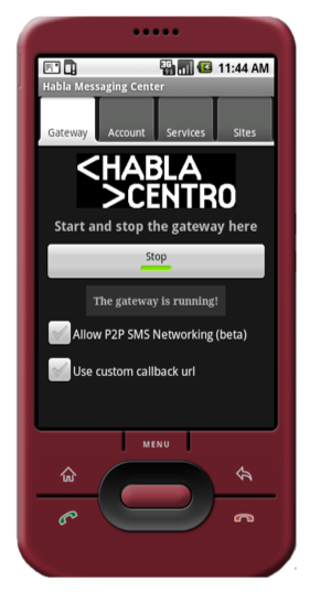
Figure 1: Habla Messaging Center

I had previously leveraged GPRS modems connected to a Linux computer to process and send text messages. Considering these characteristics, such a solution would not work at all and all our attempts to do so also failed. This led me to develop an Android based application which interacts with a backing cloud-based service written in Ruby on Rails. I developed an application called Habla Centro Messaging Center, which is easily installed in 2-3 clicks and is controlled with a single button. The application allows anyone to operate a local version of a SMS gateway without any technical knowledge. Additionally, key members of the communities can then utilize these local SMS gateways which then creates an inherent trust of their communities which helped with the adoption of the solution and more importantly the usage thereof.

As previously mentioned, the application must also work whether a data connectivity exists or not which is particularly important when you look at the developing world and crisis situations as previously mentioned.

The application addressed this in two ways. First, if there is no data connectivity, the message is saved encrypted in a local database on the handset and posted later using a background service on the device itself when the data connectivity become available again.

However, for many of the key use cases previously mentioned the information is often time sensitive. It was therefore necessary to introduce a way for this application to be able to communicate in both directions with the online entity even when its data connectivity was poor or completely unavailable.

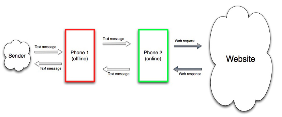
I designed a concept which I call P2P SMS Networking, which is a novel way to collect, share and distribute text messages using a network of these applications or any other type of SMS gateway even when some of the nodes are offline. Each Messaging Center allows the user of it to opt-in to become a P2P SMS Network Node. Such a P2P node can relay text messages to other P2P Nodes which can then subsequently and/or eventually interact with the central information hub.

The basic concept behind P2P SMS Networking is simple: Consider an Android phone which does not have or have a poor data connection. When it retrieves the text message, the text message will be forwarded to a second P2P Node (cellphone or gateway), which has an available data connection. This second P2P Node then posts the message online and reply back via a text message the response to the original P2P Node. This node then replies via SMS to the initial sender of the text message. This works for both pushing and retrieving information and also allows for multiple handoffs in the P2P Node Network. All communication between the nodes are only done over SMS allowing this to work even in the case of natural disasters where data connectivity is more or less always not available.

Figure 2: P2P SMS Networking Concept

This allows for the user to be able to interact with the centrally managed information hub. However, each node needs to know which node(s) it can communicate with from multiple reasons. Ideally each node should have a list of one or several helper node(s) to fall back to when it loses connectivity or cannot for any other reason interact with the central information hub. I introduced the concept of location based checkins via the application. Every 10-15 minutes the application would make a request to the cloud-based service with its location (GPS coordinates, cell network information, number). The service would then respond with a list of one or several P2P helper nodes. If such a checkin would fail or timeout, the application falls back to P2P SMS Networking if the user opted in until a checkin is successful again. This effectively shields the owner of the local gateway from any troubleshooting of issues and more importantly any training.

As evidenced, the essence of the solution is not about utilizing advanced and complex technology, but rather about choosing the right architectural elements to build up a simple straightforward user experience enabling a previously excluded group of people. It has been used across the entire world and been utilized for anything from election coverage by youth in Central America to coordination of health workers in disaster relief areas. The original implementation laid the groundworks for mobile based reporting and it’s subsequent implementations have unlocked a wide area of applications by the organizations using it.

What Is Really The Redesign Of Spot.Us?

150 150 eriks

As most of you have noticed Spot.Us now has a very different look. The main objective of the re-design has been to simplify as well as strengthen the concept of Spot.Us. The mantra for this re-design has been consistency, consistency and consistency.

We started to think about the redesign back in November. David and I attended NewsFoo in Phoenix, and after the camp we drew out the first versions of the re-design on some pieces of paper on the floor of the Walter Cronkite Center School of Journalism and Mass Communication the University of Arizona. The core of those drawing was simplicity and brevity for the pitch page. The old design felt heavy, intimidating and cluttered.

Generally, the old design was inefficient for a number of reasons and did a poor job guiding users through the process, and failed to inform new users of what Spot.Us was. I will cover a few things we identified and how we resolved these issues in the re-design. These are in no particular order of priority.

Key Issue: Inconsistent Visual Design

Inconsistency in both the visual design and user experience was a major issue. We spent a great deal of time to define the proper experience for our users by making sure all screens consistently presented the same key information. Example: Prior to the re-design the buttons for donating and applying did not have a consistent logic throughout the site. They also contained a slightly different look and feel throughout the site, which can be confusing for users.

Solution:

We addressed the inconsistency by completely re-working the underlying code for how we handle the layout of pages. We introduced a completely new way of handling and using Cascading Stylesheets (CSS), which is the technique we use to style the pages. The new model, which I call “Container Based Styling,” simplifies the code, the work with the code and also creates a flexibility Spot.Us previously did not have.

Container Based Styling allows us to move sections of HTML snippets, and the style will snap to its new position. It is an awesome approach, making the life of any designer much easier.

This new way of CSS makes the pages much more efficient to load and drastically decreases the size of the code and page. We have managed to shrink it by about 2/3 on average, including diminishing the number of files used and average number of lines inside.

Key Issue: Inconsistent User Experience

Any web page should have a consistent logic for a particular action regardless of where on the site you enter that action. One of our main concerns was to consistently give a path users take when they are required to login to perform a certain task.

Solution:

For any action we use only a single template or function to ensure a consistent user experience. This ensures the user experiences the same layouts as well as feedback for their actions. For instance, users will always be brought to a login screen by a page reload. The old AJAX popups are gone and we have eliminated all duplication of the logic.

Key Issue: Inconsistent Use Of Language

Spot.Us introduced new concepts to the market. Yet, throughout the site in the former design the language, as well as the url structure, was confusing. Some examples are: pitches, stories, posts, pledges, tips, etc. To create a pitch was denoted as “create a pitch” in some areas and “story” in other areas. In one case, it was missing completely: The browse page only referred to stories as “funded,” “unfunded” and “published.”

Solution:

For any action we use only a single template or function to ensure a consistent user experience. This ensures the user experiences the same layouts as well as feedback for their actions. For instance, you will always be brought to a login screen by a page reload. The old AJAX popups are gone and we have eliminated all duplication of the logic.

Key Issue: Hidden Community

Without our donors Spot.Us is only a theoretical experiment. The community makes Spot.us possible. We’ve had a community page for more than a year, yet we did not highlight it at all on the landing page nor on the pitch page to the extent necessary.

Solution:

The main change, thus far, is to add “Community” as a tab on the main landing page. We are aware this is not near enough. We would like to highlight it better. Hence, we are continuously working on elevating our donors, sponsors, reporters and news organizations better to give them the recognition they deserve.

Key Issue: Pitch Page Ecosystem Was Cluttered, Bloated And Heavy To Digest

This was our main driving force for this re-design, as it is the most central page on Spot.Us. This is the page where donors arrive to start their donations and read story updates. The former page did a poor job explaining the core action was to donate, as the buttons were much smaller. The page felt heavy, intimidating and overwhelming.

Solution:

The current Pitch Page is completely new. It is designed to help both the reporter and donor to engage with each other.

The core idea is to make the donation process simple and clear. We wanted to make sure that every step to and from the Pitch Page felt natural and intuitive. We spent a great deal of time to make sure the user felt guided through the process from the list view of pitches, to the Pitch Page, to the details of the pitch. We wanted to empower users to explore the parts of pitches they wanted and always have the ability to donate at any position. The focus was to condense and distribute, making the content more digestible.

The main structural changes of the Pitch Page are:

  1. Add tabs to the top of the page
  2. Decrease amount of text shown on the main pitch page by introducing an excerpt
  3. Increase the size of the donate buttons, yet preserve the style in the list view
  4. The published story is now tied to the pitch

The new Pitch Page is very different from before and there are a lot of subtle differences. We have even changed the admin menu to make it more robust — simple and flexible for reporters, editors and admins. Basically the new version is awesome!

Key Issue: Too Much Information, Yet Not Enough

One of the challenges for any organization is to balance the amount of information you give without overwhelming. For instance, the form labels were, in general, too verbatim and cluttered the form. That made it slow to digest for many reporters. At the same time, we did a poor job in explaining the purpose and effects of Spot.Us.

Solution:

We resolved this issue in two different ways: simplifying the language and url structure, as well as introducing a complete tool tip framework.

Throughout the site users will see hover effects in some areas explaining the meaning of a button, an icon or a label. For instance, the “free credits” button has a hover to explain what “free credits” mean, and some of the forms now have a little question mark icon that further explain what the label and form elements are. We will roll out more of these tool tips through the site to help our users understand what each element does.

Key Issue: Our Google Search Widget Didn’t Adequately Help Our Users

Previously we used Google to provide search capabilities to our community. The disadvantages were: it was not instant, it was not simple, and it failed to allow for a more advanced search functionality.

Solution:

Sphinx is a simple off-the-shelf search engine that has a very nice and tight integration with Ruby on Rails. When you search on Spot.Us now you will see the same layouts as the rest of the pages. This functionality will allow us to show related pitches easily using this simple search engine.

Key Issue: Poor Performance, Slow Load Times, Etc

When I joined Spot.Us, the performance of the site was a main concern for me. Site performance is one of the most common design mistakes.

Solution:

I have continuously added improvements to ensure faster page load times. With the new re-design, the countermeasures implemented have allowed us to drastically improve the performance of the site.

Conclusion

The new re-design of Spot.Us is a big step towards a much better frame for the concept. We’re always working to improve the site and the experience of the users, so we will continue to modify the layouts according to the feedback of our community and supporters.

I do want to specifically give huge thanks to Lauren Rabaino. Lauren has been amazing throughout the process of re-shaping Spot.Us. I really do appreciate her openness and strife to endure the intense design work we carried out. I threw an entire new concept of CSS layouting at Lauren and she embraced it. I also pushed hard to get the consistency and structure in place.

Thank you Lauren, for being so willing to learn and grow through the process.

Finally, do let me know if you would like to see a specific feature implemented or if you have questions or concerns about the site.

This blog post was also posted here: http://blog.spot.us/2011/02/12/what-is-really-the-redesign-of-spot-us/

Blogging over the ocean – Part II

150 150 eriks

I am now over the same ocean, but in another direction transiting home to Sweden to meet my family after ten amazing days. Ten days that has taught me so much. Ten days with incredible experiences and companionship. Ten days of peace, happiness, and excitement. It has truly been an incredible and wonderful time. All thanks to the dearest person to me.

The trip has very much proven to me where I want to be and why. These ten days have amazed me in so many ways. So many impressions. They have shown me what really matters and ultimately guided me into the path I probably already knew in my heart is right, but in some ways was afraid to pursue. How that path can become reality is another problem however, but time will tell how that will happen.

I am sad to leave. I wish I could stay. I have many reasons why, but I will not go into details. Yet primarily it is one reason. I do believe the place and company are right. It is right on all levels.

I have mixed feelings flying here over the ocean. Part of me just wanted to stay, and part of me look forward to see my family. It has been a long time since I last saw them.

One thing is for sure. It felt and feels empty leaving… It felt like home to the soul.